For people who take their body seriously but refuse to make it a chore. The intelligence layer between your goals and every proven way to reach them.
01
Effortless
AI removes the work of tracking. One photo, done.
02
Elevated
Every surface deserves to be screenshotted. Design is the product.
03
Earned
No gamification tricks, no shame. Consistency compounds.
04
Expansive
Tracking is the front door. The hub is the destination.
TaglineEvery bite, understood.
Lockupkalo · every bite, understood
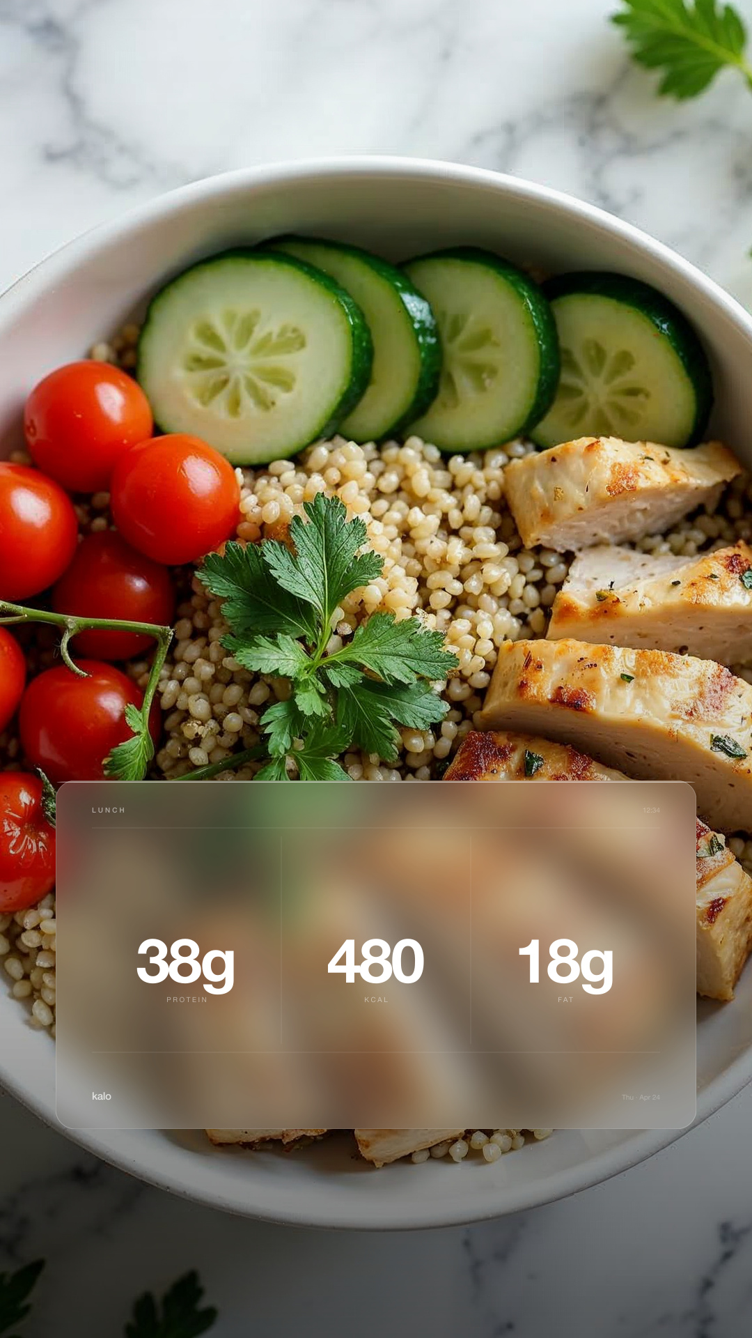
SubheadPhoto, voice, or barcode. Personalized nutrition you can act on.
02 · Voice
Say less. Imply more.
The brand sounds like the friend with flawless judgement who tells you what's worth knowing: knowing, quiet, generous. Never the cheerleader. Never the doctor.
01
Say less, imply more.
Three words beat seven. Trust the reader to fill in the rest.
02
Data is prose.
Numbers carry meaning on their own. Don't dress them up with adjectives.
03
No shame triggers.
Never "missed," "failed," "over budget," "cheat." Consistency compounds.
04
No theatrics.
No emojis, no exclamation marks, no confetti. Not in product chrome.
Don't
Great job crushing your goals today!
Do
You hit your protein target.
Don't
Oops! Looks like you went over your calories.
Do
42 kcal over. Nothing that won't level.
Don't
Log your yummy food now!
Do
Log a meal.
Don't
You're on a 7-day streak. Keep it going!
Do
7 days logged.
Don't
Ready to crush your fitness journey?
Do
Let's set your targets.
03 · Palette
Clean colour. Sharp data.
Four core colours carry the brand. Macro colours are separate data language. Click any swatch to copy the hex.
Core · brand
Porcelain for space. Graphite for trust. Signal Green for capture and primary action. Clementine for proof and share highlights.
Data · macros
These colours are not brand colours. Use them only when a number needs category meaning in charts, rings, rows, or meal summaries.
Data language
Numbers are the product. These rules govern how data is displayed across every surface.
Calories · #1E6BFF
Protein · #FF3B5C
Carbs · #FFC400
Fat · #00B84A
Never use data colours as broad brand colours.
Brand encodingSignal Green: #00C875 for capture, selected states, and primary actions. Clementine: #FF7A1A for proof, share cards, and rare highlights.
Chart typesRing or donut for macro breakdown. Single-line for trends. No pie charts, no stacked bars, no 3D.
Number formattingCommas for thousands (1,840 kcal). One decimal for grams (43.2 g). No trailing zeros. Never round to 10s.
Trend linesGraphite line by default. Use data colours only when comparing macro categories. No grid lines. Value labels at current reading and meaningful peaks only.
UncertaintyShow a ~ prefix when model confidence is below 85%. Never hide uncertainty.
04 · Typography & Logo
One face. Used at scale.
Aeonik across every surface. Numbers should feel measured, not decorated. The wordmark is lowercase, confident, quiet.
Three approved colorways. Signal is reserved for surfaces where the mark needs to communicate capture.
Graphite on Porcelain · defaultPorcelain on Graphite · dark surfacesSignal on Porcelain · capture only
Don'ts
Never modify the mark. Six common errors.
Don't stretch or squashDon't outline the markDon't recolor outside the paletteDon't add shadow, glow, or 3DDon't rotate or tiltDon't place on busy backgrounds
CasingLowercase in marketing. Title case "Kalo" in product chrome.
ContrastPorcelain on Graphite; Graphite on Porcelain.
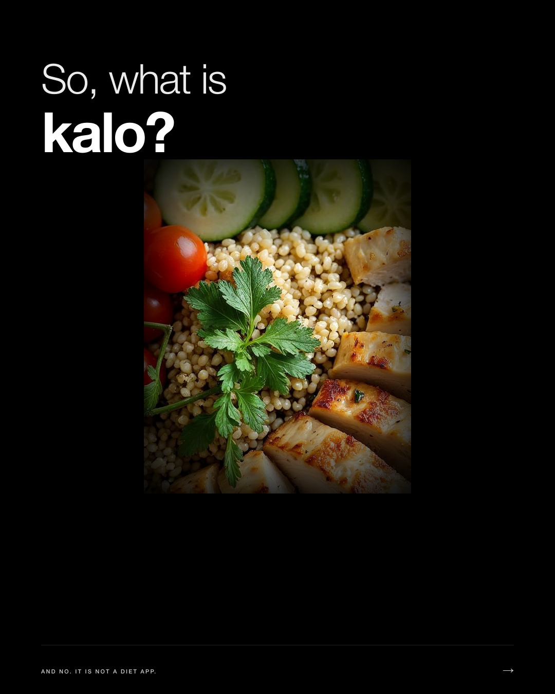
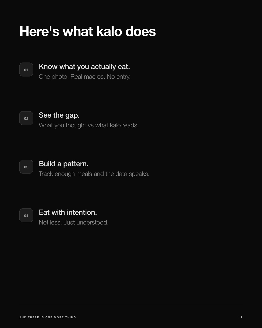
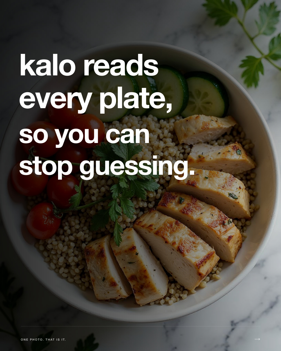
WHOOP-format carousel introducing kalo. All 1080 x 1350 (Instagram 4:5).
01 · THE QUESTION
02 · THE VALUE PROP
03 · THE MANIFESTO
Numbers in mono. Prose in sans. No decoration.
One accent per card. Wordmark bottom-left. Timestamp bottom-right.
4:5 for IG · 9:16 for Stories · 1:1 for grid.
06 · Content
Show the plate. Show the number.
Every post proves the feature, educates the portion, or admits a miss. The north-star metric is sends per reach above 1%. If a post wouldn't get DM'd to a friend, it doesn't ship.